I TOLD you I wouldn’t leave you hanging too long after our last kitchen update post. Things seem to be happening fast now (it’s about time), and it’s so exciting to see things start to come together!
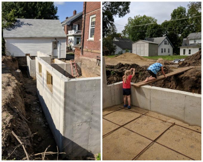
Last time we left you off with this concrete kitchen hole situation.
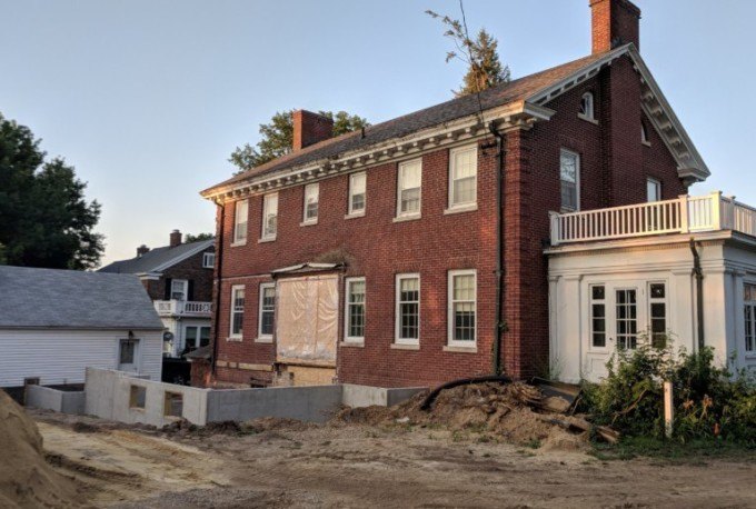
There was a trench around the outside of this basement that needed to be filled. We lovingly referred to it as ‘THE MOAT’, because with all the rain we got in September, it had a surprising amount of muddy water in it.
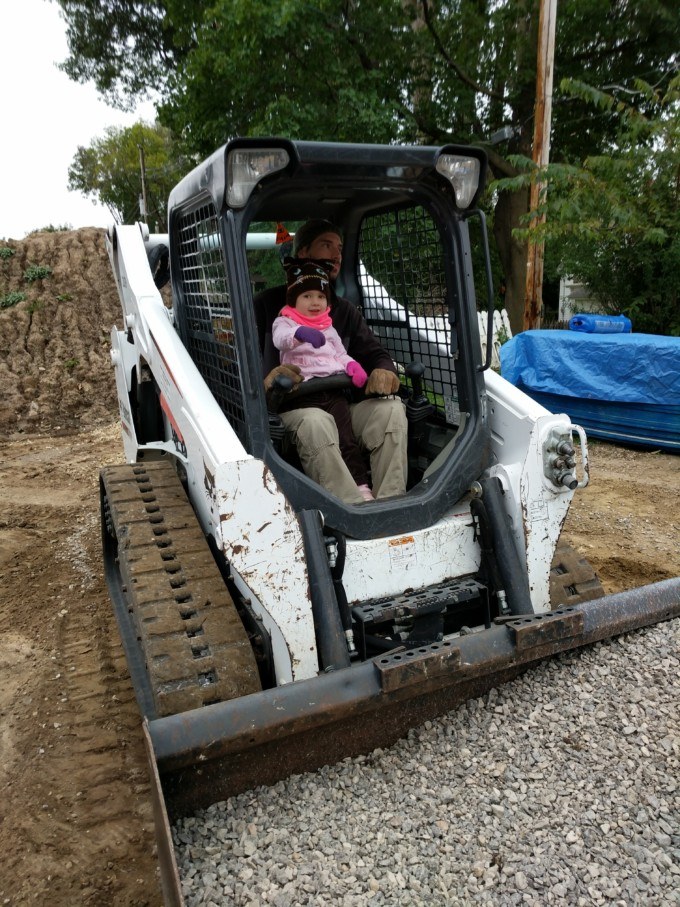
Before the framers could come in, we needed to get this filled to prevent casualties. So Nick rented a skid loader for the day and moved some dirt and gravel. He couldn’t have done it without his sidekick though.
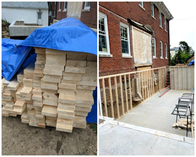
It was a glorious day when that lumber truck appeared and dropped of all that sweet smelling pine. HELLO FUTURE KITCHEN! My new best friends showed up and started wrapping that dank basement with studs, and I could faintly hear some angels singing in the distance.
Originally, we were planning to have our workshop below the kitchen, but since it’s going to have an open staircase up to the kitchen, we didn’t want to worry about sawdust floating up, or suuuuuper loud tools interrupting conversations (I’m looking at you router). So instead, we’re going to use the large room in the basement that has the fireplace as our wood shop, and we’ll use this room below the basement as a family room / overflow play area for when we’re entertaining.

FLOOR JOISTS NEVER LOOKED SO GOOD.
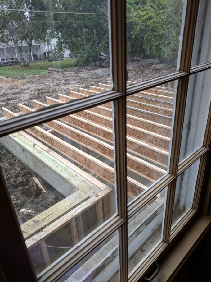
That pic above is looking through the living room window into what will be the kitchen. It’s fun to think about how this window will eventually be a doorway connecting the living room and kitchen together!
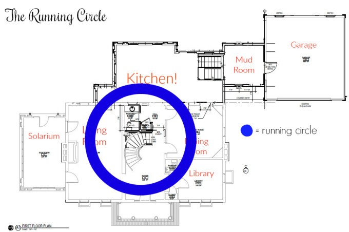
I know a lot of parents don’t let their kids run in the house, but one of my favorite memories as a child was playing ‘Daddy’s After Us’ and running around the ‘circle’ in my childhood home. It’s important to me that our home have a ‘circle’ for the kids to run. And it seemed like a no-brainer to connect the kitchen and main living area anyways. #commonsense

Before long, my kitchen walls were taking shape! This is when it really started feeling REAL! I can actually walk around my kitchen and imagine where my island and appliances will be. Is it weird that I’m already picturing all the memories that will take place in this room?
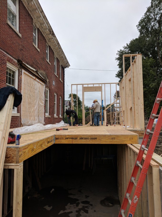
Here you can see where they’re attaching the kitchen addition to the garage via a decent-sized mudroom!

As it stands today, the walls are up and have Tyvek on them. The roof is done but still needs the roofing guy to come and put on the waterproof roofing business, at which point the framers will come back and put in windows, doors, and stairs to the basement.
WE’RE SO CLOSE to having an enclosed space!
And it’s a good thing, because November.

The plan is to finish off the exterior to perfectly echo the same architectural style as the sunroom ‘solarium’ that you can see off to the right in this pic.

We’ve been working with the Iowa Kitchen Company (not sponsored) and nailing down our kitchen layout and finishes. We love the plan for the lonnnng L-shaped counter and massive island that will seat 5.

Here are side views facing west and south. Y’all, those are 10 FOOT CEILINGS!


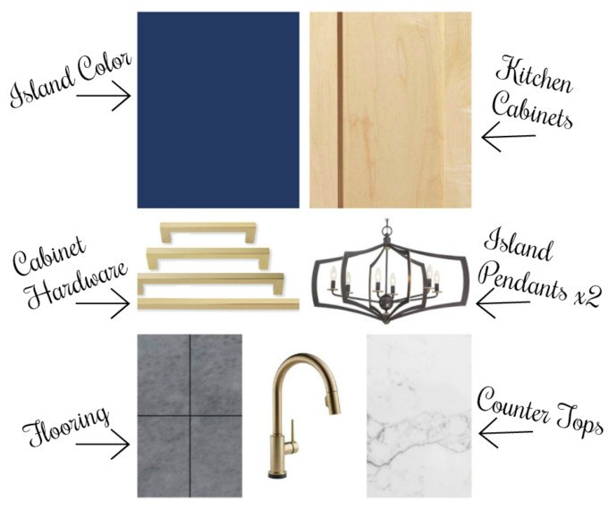
The plan is for the cabinets to be maple, and the island to be a navy blue. The countertops will be white quartz with some gray veining. The flooring will be a medium gray-tone tile (heated!), and faucets and hardware will be gold! Here’s a little graphic I whipped up so you can see all the finishes together. I love how it all looks as a group!
We’re teaming up with Artistic Tile for the backsplash because I’m SO OBSESSED with their unique patterns of tile. Seriously, go look at the options on their site. I really want the backsplash to be the statement in this kitchen… the conversation starter if you will.
I’m having a hard time deciding between two of their patterns, and I need your advice!
The first one is called Blue Note Circles and I love the variation of different blue tones and how it would pull the navy blue of the island in with the rest of the kitchen for perfect cohesiveness!
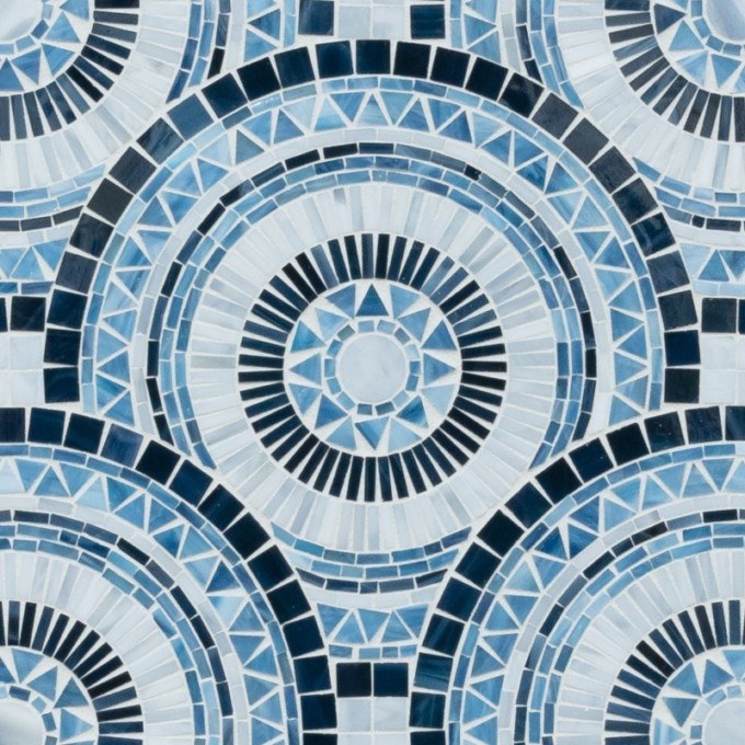
Here’s a pic of it in a different colorway so you can see the sizing of the circles. So fun, right? Can you picture it in the blue?

The other option I love is called Tamborine Traps and has such a fun / quirky quality about it. It also has the variation of blue tones too! Although I’m not sure if it will come across too dark. Thoughts? There’s going to be a couple places where the backsplash will go all the way up to the ceiling, so keep that in mind!

Here’s a pic of it installed, again, in another colorway. It helps to be able to see the scale and be able to better picture it in place.

Below is a rough rendering from our designer that shows the layout of the kitchen. There are a lot of things it’s still missing in this pic, and the range hood will be totally different, but nonetheless you can see how significant the backsplash area will be and how it goes all the way to the ceiling. There’s a part on the left that you can’t see where the backsplash will go all the way up too.

I put together a collage for each pattern showing it with the other finishes in the room. WHICH IS YOUR FAVE? Please comment below!
Option 1

Option 2

These decisions are so hard, and feel like such a huge important matter! PLEASE HELP! Tell me which one is your fave below in the comments to help us decide!
~Bethany
~~~~~~~~~~~~~~~~~~~~
Below are links to posts that we’ve published about our ‘new’ house and it’s progress!
 .
. .
.
 .
.

 .
. .
.
Related:
-

If you've been following along on the 'gram or Youtube, you know we've been turning…
-

If you follow our adventures on Instagram (we're @RealityDaydream!), you know we pulled the trigger…
-

Our very best friends moved away to Tennessee, but we still find reasons to visit…
I like Option TWO in the more muted blue color. It concernes me that the dark blue in opt one would be way too busy .
I said lighter blue shade but I meant the gray color everyone else perfers as well. Sometimes brighter is not always best.
I apologize if I missed it, but where are the kitchen pendants from?
They re from Build.com! Here’s a link: https://www.build.com/minka-lavery-4376-579/s1129600?uid=2711005
I love the circles!! but I agree in the lighter gray for all that space;) I love the floor plan though cant wait to see it completed !!
I like the circles but I prefer the grey. I think there is enough blue included that it will look great with the island. Just my opinion tho. Can’t wait to see it finished.
I really like option 1 but with the more modern light and handles I think option 2 would be better. But whichever one you choose it will be awesome, you have such a great eye.
The circles are fun BUT I think too much for the amount that will be seen in the kitchen. How about in a bathroom instead? I don’t think the triangles will feel too dark because of the windows and light cabinetry.
I think Option 1 has your name all over it!
I love the circles! I think with so many hard edges of the cabinets that the soft circles will really help soften the room overall as well. I also think it gives it a more “homey” feeling too and can totally imagine you guys cooking with all of the circles around you. Plus as a bit of coincidence, you wanted there to be a circle for the girls to run in, they would also have the circles in the kitchen as well to get them going. Good luck with the finish line, you’re doing great and can’t wait to see how it turns out for you.
I’m all about the “running circle” in the home too. I didn’t have one in the home I grew up in but our first home my husband and I lived in had one and the kids loved it. So when we bought our second home, we remodeled it to have one too.
As for back splash – I love option #1.
I LOVE option 1. The circles are unique and adds some softness to a space with lots of square and rectangular lines! Bottom line, do what you love. You are the one that is living there!
Option 1 but in the lighter color so you can easily change decor without having to redo the tile.
I changed my mind. Circles in blue! There is more white in them than in the triangles.
So funny how I can’t decide and it’s not even my house 🙂 🙂
Definitely the Blue.
Such a hard choice. I love the circles, but I’d go with Option 2 in blue on the walls. It would be great if you could do a row of the triangles along the top or bottom, but I don’t think it will work with the circles pattern.
I like option 1 but I would not put that busy pattern on that large wall. I think you would soon tire of it. I say jazz up the kitchen in other ways and use a subdued tile for your back splash. Just the old ladies point of view.
Option 2 I love the best, but in the grey – I think like lots of others that the circles are too busy and…. if you chose option 1 I think you could get fed up with it after a while and if you chose the grey on Option 2 – you could use a lot of other colours for your blinds/curtains etc and easily paint out the blue on your Island as and when in a few years time.
I agree with Renee Pederson………. Option 1 if you are solid on the two …… but I would not go with the blue….
I love the circular tile best! You should go with the color you prefer, but I just love the more subtle gray color in the picture you shared. Your kitchen will be so gorgeous!
OMG! I love both. Considering your love of the brightness of your last kitchen GO FOR IT. You clearly don’t tire of unusual choices so pick what you love and don’t let anyone talk you out of it.
Ok, so here is my take on it. I love everything but the tile. Everything you picked for the kitchen is timeless; the cabinets, the countertop, the hardware, the layout, even the navy blue island is a fairly safe option but your back splash is really, really NOT safe – either one of them. Do you really want to do that? It would be so easy to get tired of either one of them really fast and want to replace them. That is such a huge expensive and a pile of work removing the old ones and replacing them with new ones. I guess I would like to see something more timeless, like the rest of your kitchen. That is an old lady’s take on it. Now with that being said, I like Option #2 but I think I like it in the gray. It has the blue in it but it is a little more subtle tones. Hope I didn’t offend you!!!!
Of your 2 options, I like option 1 best. But my order is Option 1, the alternate colorway, option 2, the alternate colorway, option 1 your colorway, option 2, your colorway. Agree with others that they may be too bold otherwise.
Also totally agree on the double wall oven. DO IT
My favorite is option 1! I love the circles, I can’t wait to see it all come together!
I like option 1 & it seems to fit in nicely with your circular running theme from your childhood which you are carrying over for your kiddos! Either way, it will be beautiful! Enjoy your new home & all the wonderful memories you & your family will make here!!!
I think option one, but in the color choice that is the bathroom picture, rather than the color you are currently intending. The darker colors will be so busy and you already have quite the focal point with the navy island.
I like option 2 the best. The circles are pretty but they are very busy and will dominate. The triangles will stand out but also compliment the rest of the kitchen. I agree with the wall oven idea. Unfortunately I don’t have room (my house is tiny) but wall ovens are part of my dream kitchen. I’m not crazy with the gold accents, but that’s just me. I would have gone with the tarnished look the lamps have for drawer pulls and faucet, especially since there’s greys and silvers in the countertops and tile. I feel like the gold won’t tie into anything. I can’t wait to see the finished kitchen! 😀
I think the triangles are too spiky and give an overall feel that the pieces are too small. I like the circles but definitely in the color shown in the sample setting, not the bright blue. I think a pattern with larger tiles would be better in that large space though. Too many choices, right? It looks like it will be fabulous! Good luck.
While I love the circles I think they’d be way to busy on the big wall. Like many others I’d go with the triangles but in the grey. Is there somewhere else the circles could go? I think they’d make a great feature wall in the shower or for a backsplash in a laundry.
Actually, you’re making me wish for the $$ money to update my laundry using a similar tile but my 40th Birthday O/S trip must come first, then finish building the back deck that has a roof and no floor…
I think you should consider the lighter coloured triangular one – it still has the blue tones of your dark feature colour, but won’t be as heavy looking on the wall.
Number 1 is my choice also. I think you might not like all the sharpness in#2. Can’t wait to see it up on the walls.
I vote for the circles. They seem a better fit for an older house. And I just like them.
Option One! Love the circles ..,
I think Option 1 is too busy and it would get tiresome quickly. Love Option 2.
I’m with a lot of others and think Option 1 looks like wallpaper and much to busy, so I’d go with Option 2. Also, if I had the chance to design my own kitchen I’d sure put in 2 wall ovens! When you get older it’s a lot easier to take things out of the oven, plus for big family meals it’s nice to have the extra oven.
Definitely option #1 the circles are so much fun!
Option 1 looks more like wallpaper but it is circular so will definitely make the squarishness of anything else in your kitchen stand out. It is a stronger color of blue which could more quickly become tiresome. I feel it “pops” more with the gold coloring.
Option 2 seems to be more of the style that you like. It isn’t as strong of a color which will give you more options in the long run. However, it is angular like your kitchen cabinets so you may want to get rounder decor to offset all the lines. The gold accents don’t pop as much with this pattern.
Personally, I don’t like either one but feel you would be happier with option 2 down the road.
Option 1
So my honest opinion is that I adore the circles to offset all the angles of the kitchen but, am concerned that with the bold blue you may tire of the color and want to replace it which would be costly considering the amount of backslash you have as blue doesn’t “go” with as many options as a grey would. However, this is your house, not mine and YOU did create the amazing kitchen at the farm house so I say go with your gut…
I like option 2 I just think 1 is to busy and will draw your eyes to much. I just think it would compete rather than compliment…
Option 1 all the way!!! I’ve been drooling over that tile for ages, it’s so stunning ?
I prefer the gray colors to the bright blue. I feel like either choice in that blue will totally dominate the whole kitchen….unless that is what you want! Both are busy designs, especially the circles, and I would be afraid of getting tired of them.
I like Option 1. I think all the circles in the tile balance out all the right angles in the kitchen–and it’s such a fun design. I’m sure either choice will fantastic in such a beautiful kitchen though!
I like option 2. I think the circles look too ‘busy’ especially where they would go all the way up to the ceiling. I love your home and am looking forward to seeing it finished.
Option 1. The Circles. All the way.
I have to agree with Giuliana, but I think you could use the circle tile on something else. Maybe a drinks tray,” bar” cart or even a wine/coffee station type area.
Option 2 is my favorite. Amazing job, thank you for sharing.
Option 1, love the circles! Can’t wait to see your end results, it’ll be beautiful!
Circles. Adds some curves to all the straight lines 🙂
I like option 2 better but I like the gray color way better. It looks warmer with the gray but still has a little blue in it to tie the floor and island cabinet color together.
Circles.
I like them both, but I would vote for Option 1, Circles.
Congrats on the new kitchen! Love all the finish choices you’ve made. (Maple and gold is also my first choice for any room.) Any of those backsplash options would be a great choice, but I’d go with the circles, since a kitchen requires so many straight, angular lines. I think the circles would break up the monotony, making your backsplash a more dramatic feature. Best wishes!
I’m not much help on the backsplash, but we’ve lived in a lot of houses. If I ever designed my own kitchen, I’d leave the island completely flat and I’d make sure my sink and stove were fairly close and inthe same piece of counter. Right now we have the opposite of your design with the sink on the wall and the cooktop on the island. I hate having to walk with boiling pots of water over top of kids and dogs. Or dripping stuff between the two. And I loved the two houses we had where the island was 100% useable space!
We have a navy island and white quartz with grey veining so I obviously love your choices. I’m leaning towards the circles. This is all such exciting news!
Honestly, I really like them both. I liked the circles close up, but once I saw the far away ishot, it looks like a bunch of eyes staring at you ? So my vote goes to the triangles! I think it’ll still be bright with the white counters, windows, and open stairs.
Anti circle here, I think it will be busy! The tambourine, though dark, has cleaner lines and an irregularity that I love!!!!
I think I love the circles and when I first saw it, it felt like it matched your style. I cannot wait to see the finished look!
Not a hug fan of the tile choices so I’m no help. But I do like the cabinets and other finishes. Excited to see what you pick and how everything turns out. The large island will be amazing.
Option one for sure
Option 1!!
Option 2!
I like them both a lot, but I feel like option 2 sort of blends a mid-century and art deco feel.
It’s option #1 for me. Either would be lovely and fun, but I’m partial to the circles!
Circles all the way. It’s so fun and it’s so you.
I love option 1. I am worried that option 2 might be too dark (which could be OK depending how much natural light you will get in the space). But, #1 for me is so much fun and different (and I like things that are more unexpected). I am excited to see the transformation take place!
I LOVE option number 2! Option number 1, on the other hand, I really think would look too buzzy, especially on the parts that go all the way to the ceiling. I also love how everything looks togheter, It’s going to be an amazing kitchen =) Congrats!