Wouldn’t you know it? It’s Monday AGAIN! Doesn’t it seem like the ratio of Mondays to ‘other days’ is at least 1-2? A tragedy for sure.
Nick’s been working on the ‘wall’ lately (it’s actually NOT a wall anymore, but I’m not sure what to call it… the ‘arches’? the ‘pillar’? the ‘construction zone centrally located in my home’?) so anyway, I’m finding myself with a lot of time that I need to find something to do to keep busy. I’ve been painting away at some fun upcoming projects, but I’ve also been working on designing up some Business Cards!!
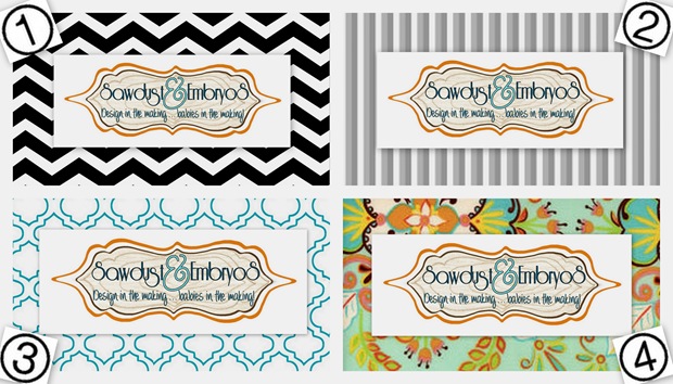
 This is where you come in. I need your opinion, like pronto. There’s something about each one of the designs below that I totally love. And since I can’t have them all, I’m needing some advice.
Ready Set GO!
Which Business Card Design is YOUR FAVE?!?!


I had this thought as well, but it’s actually MUCH harder to see our logo without the white backdrop around it. Having the busyness of the border coming right up to the edge of the logo does it no favors whatsoever. So we’re sticking with the white rectangle! I can’t wait to get #3 and #4 in the mail! We ordered them to have rounded edges!!
Hi! I don’t want to be Debbie Downer, but I agree with Anonymous above. Your cool new logo is hard to read with the white background on top of the pattern. You need to be the star of the business card, not the pretty background. If the white pattern could be removed and the S&E logo made larger, it would be much easier to see.
I like all the designs!
Is there a way you can “cut” the white behind “Sawdust and Embryos” to match the shape of your logo (instead of having a white rectangle)? Might not work, but it’d be interesting to see 🙂
the ratio of mondays is off!!! did you notice there are 5 mondays this month… ugggg… oh and i am a sucker for chevron 🙂
I agree number 2 is great. But number 4 seems to stand out the most to me.
Crystal
#2! maybe its the architecture wife in me…..
I agree with the first commenter. You CAN have them all!!
#2 all the way.
This lurker says…..#4 is the most “you”.
I like both #1 and #3. I love all things chevron so I voted for #1.
I know I’m in the minority, but I voted for #1 because I like the way the white in the chevron bleeds into the center. I was initially drawn to #4 because of the color. I think it would be cool with the same pattern in the color if your orange chair.
I think we all love the color!!! However, there is no reason why you can’t use two or even three of them at a time. It makes life interesting! Like you and Nick! (and of course, the kidlets too!!!)
I like 3 and 4! And yeah people will only ever see one business card at a time so I’d say you could have all too!
you actually CAN have them all! As long as your logo doesnt change the background can. I have seen MANY small design businesses do that. It shows they are creative, stylish, and NOT set one 1 particular style. I say go for it!