Well it’s been a week, and I STILL LOVE my chartreuse kitchen cabinets! It was fun to watch the wide array of comments flow in. I think it’s fair to say… you either loved it or ya hated it. And that’s ok! A lot of my design choices are off the wall… it’s just my style. And you still read my blog, sooooo…
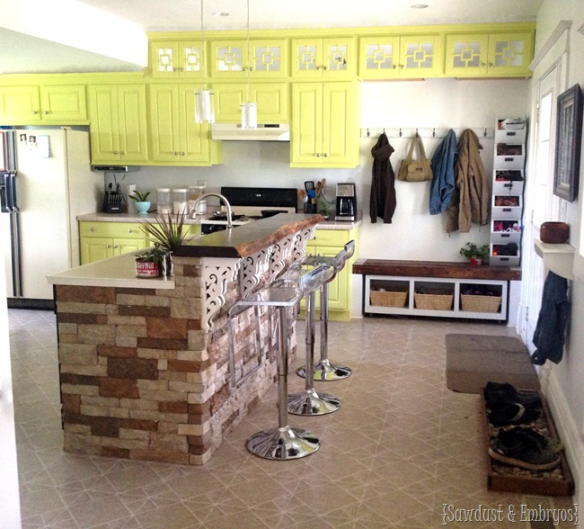
I love to mix different design genre’s to create my own personal style. If having white walls, white cabinets, and white counters are what it takes to have a magazine-worthy kitchen… then I want no part of that! I think we should all just decorate our home with colors and things that we love, instead of what’s all over Pinterest or HGTV. Touché?
High fives!
Group hug!
I affirm you!
Now let’s talk about mah backsplash…
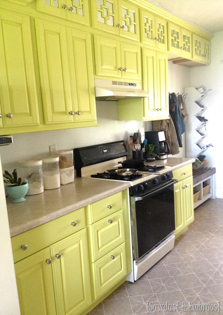
(I feel like I should say this again… WE’RE SAVING FOR STAINLESS APPLIANCES. Because, ew)
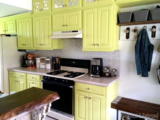
With the cabinets being so bright and the island providing visual interest, I knew I wanted the backsplash to be subtle yet still complement the whole design… pulling everything together!
So far, I’ve found ways to incorporate wood elements, color, and natural stone into my design. But I’m missing something shiny / metallic. This is the key to meshing all these styles together!
I asked my BFF’s at Royal Design Studio if I could try out their Pearl Oyster paint and their Honeycomb Allover Wall Stencil to give me that shimmer, as well as a bit of texture that wouldn’t fight with the stone on the island.
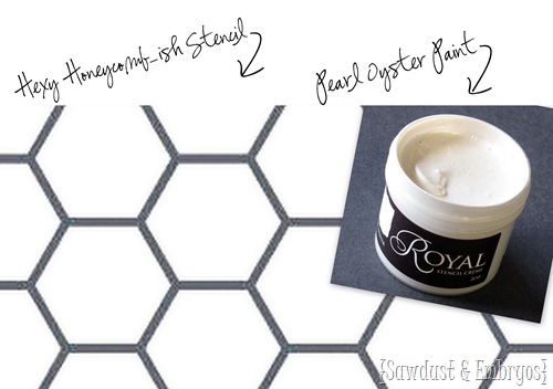
I did a little test run, and I loved the idea of it… but it just seemed so one dimensional. See what I mean? (old wall color and cabinet color in this pic obvs)
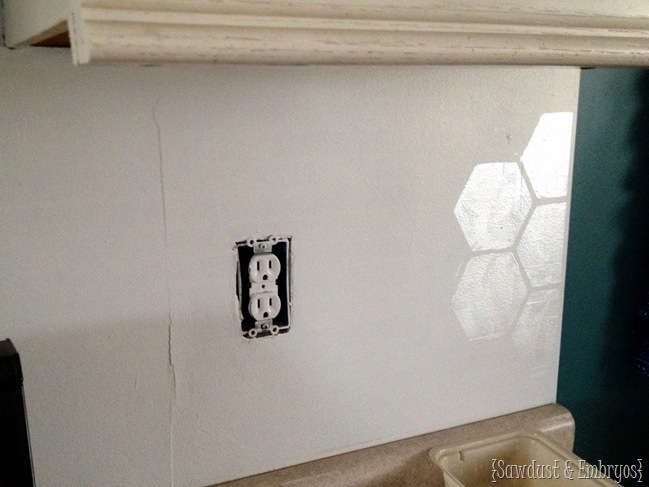
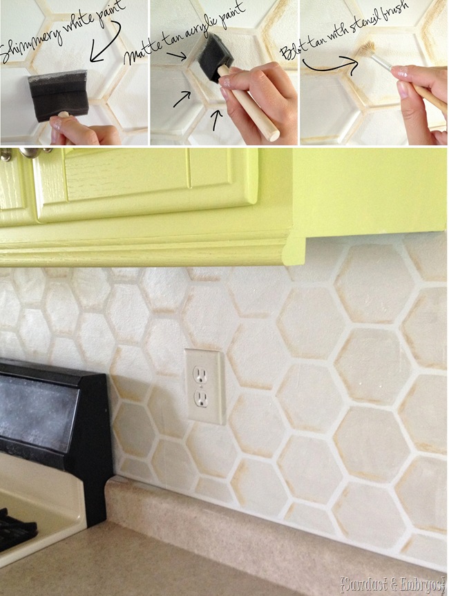
The technique we normally use to paint backsplashes incorporates a handful of various matte neutrals to create a natural stone look. But since I wanted this to look like shimmery classy white tiles, I had to get creative to make these ‘tiles’ look genuine.
As you can tell in the video, I just blotted on the shimmery white paint with a sponge brush (in hindsight, I would have used a stencil brush for a more even finish), then while that paint was still wet, I very lightly blotted on some tan acrylic paint on the same 3 sides of every hex to create a ‘shadow’ effect.
If you value your life, you won’t say anything about my grimy stove.
This shading truly makes it look like the ‘tiles’ stand out away from the wall! And is so S.I.M.P.L.E. You could pull this off while eating a candybar and with a toddler pulling on your leg. Pinky swear. I would know.
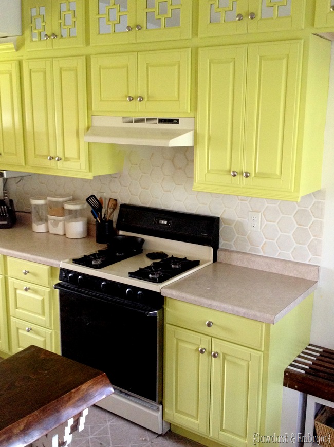
I love that it’s unique and makes a statement, but still subtle and reads more as a texture than a pattern. A perfect middle man between the rustic and modern elements in my kitchen!
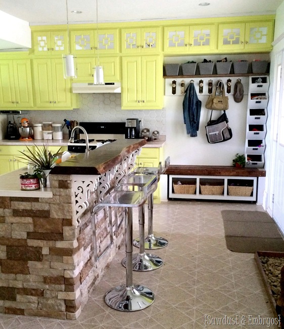
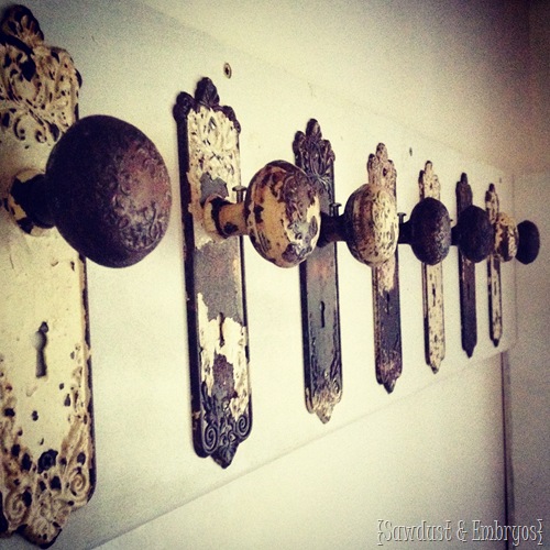
OH YEAH… did you notice any little changes to the mudroom corner? We slapped some old vintage door handles (that we found in our basement from the previous owners) on a board to use as coat hooks. It just DOES it for me! Don’t you feel like it’s just speaking to you? Whispering ‘I’m awesome’.
Cocky SOB.
I also finally got the shelf up above the coat hooks too. I bought some bins to keep off-season items. Hats/mittens and such are up there now. The girls are currently using their cubbies for sidewalk chalk, bubble wands, and umbrellas. The bins are just plastic containers I bought at the Dollar Tree, but eventually I’d like to buy some galvanized bins to put there. I’m keeping my eye out for the right dimensions!
The other day I found a tutorial for PAINTING YOUR KITCHEN AID MIXER professionally! So Awesome. It actually explains how to take your mixer apart and which areas to tape off, and which kind of paint to use! I’m tooootally going to do this! The orange just doesn’t work anymore with the chartreuse cabinets. I found a handful of colors that I kinda like, but I super need your opinion. What are your thoughts?
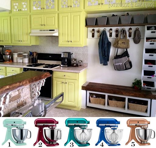
I even numbered them to make it easy for you to vote. I seriously don’t know! Do I want another bright pop of color as an accent? Or something more subtle? Tell me in the comments!

Your stenciled backsplash tutorial is a game-changer for anyone looking to add a unique touch to their kitchen. The intricate design you chose is stunning and adds a real wow factor. Your detailed instructions and the included video make it seem achievable even for beginners. I appreciate the tips on paint and sealing too. This project will undoubtedly elevate any kitchen’s style.
This turned out so good! I love the look of the hexagon tile. I am painting our kitchen cabinets & this would be the perfect touch to finish up the space. Thanks so much for the inspo!
This stenciled backsplash turned out so good! I might have to try this technique out! We are having our kitchen cabinets refinished next week so maybe once that is done! Thanks so much for sharing!
Just looking around and I found this page. First. LOVE the cabinets. Second. LOVE the door knobs (we don’t have mudrooms where I live but we do have jackets everywhere except hanging on the coat rack). The stenciling is wonderful, I’m going to do the same if I can narrow down the 20+ styles I have chosen, today. I am sure you have painted it already but my choice is for 2 :)!
number 3 all the way!
I just found your blog today a friend sent it to me. I wanted to comment on your tile back splash but comments would not load. I was going to suggest you paint the outlet covers so they blend in and don’t stand out so much. It’s what I did. I did the kitchen in my shop last yr. I also redid the ugly old maple cabinets and turned them into a barn wood look. I also Painted the counter tops to look like Granite counter tops, They turned out great. I did subscribe to your blog and I have never done that before. As for the mixer I say #5. I can do without that color of cabinets but hey your the one who has to live with it. Love everything else.
Very cool! Thanks for sharing! And welcome 😉
I’m in love with 3!
#2, yup. Hands down.
Hey girl! I am loving #4 – there’s something about cobalt blue. I think the kitchen looks amazing. Keep it up!
#5 I find it to be a both a little old school and current, which goes with the other elements of your kitchen, not to mention it’s another metallic to keep your backsplash company.
I love #2 for a great pop of color!
oh and i agree that you should continue the stencil for above the mud room bench
its a toss up between number 1 and number 3 on the mixre colors.
also, not sure if i would do that color cabionets for me, but i LOVE the look of them! rock your own style! you are the one who has to live there, you might as well enjoy it!
YES! I love that you’re beginning to embrace color! 😉
Lara, send me an email sawdustandembryos@gmail.com …Nick took pics of his process just in case someone asked. LOL! Life of a DIY blogger, haha! He can totally explain his process and send you a couple pics.
#3! Also, I am for sure Team Chartreuse. Absolutely love it. Design risks = happy.
I like #1 or #3 for mixer colors. I LOVE the mirrors behind your extended cabinets. looks very cool. I love the cabinet color. I wouldn’t be that brave in my kitchen but it looks great in yours. My bedroom is a bright yellow color with black and white accents. Kudos to making your own color choices.
#4!! But #2 & #3 would look nice too 🙂
I’ve never commented before but today as I was reading your post, my 5yr old came over and said she likes #5 and I said I like #3. BTW, my 5yr old REALLY likes your blog. My 2yr old loves posts which show your cutie pies. Thanks for being “unconventional interior designer!” I really love seeing what you and your talented husband are up to in the world of building and making your house your HOME! Also, thanks for encouraging us to get things done in our HOME!
Haha Selma! Well I’m glad you decided to comment. That’s so sweet about your littles!
Love your boldness and your ability to pull it off! The kitchen looks great. Someone mentioned painting the appliances, maybe you could paint them black until you get new ones? BTW, I love #3. =) Keep up the good work!
I’ve definitely thought about painting the appliances, but we’re getting pretty close to our $$ goal to buy new ones. Our dishwasher doesn’t work at all, and the handle keeps falling off the stove. It’s just TIME! 😉
#1. Goes beautifully with the yellow! Love love love! The door handles, brilliant! And beautiful!
# 5 or #1 🙂
#4 would add richness, imo
A magenta/purple would be a fun pop of color to go with the new cabinet color.
#4. You could get some cool fabric (for oven mitts, hot pads, whatever) with chartreuse and cobalt blue to really pull it all together. Here are a couple that might work these from Joann’s Fabrics:
http://www.joann.com/home-decor-print-fabric—kas-kellam-navy/11376894.html#prefn1=refinementColor&prefv1=Blues&start=1
http://www.joann.com/home-decor-print-fabric-waverly-solar-flair-lime-and-indigo/12222386.html#prefn1=refinementColor&prefv1=Blues&start=1
I would say # 5
Sorry, don’t like the cabinets, but I like YOU and I LOVE the backsplash. Wow, does that ever look like tile… fabulous job.
5 would look the best, but 1 would be good too!!
#5!!! I think that color plays off of the island and the mudroom bench and ties it all together.
LOVE the stencils!
#4
And the door handles as coat hangers is great!
Stop with the inspiration! My house is full of half finished projects and now I need to do the kitchen! I’m thinking butter yellow for the cabinets, but I really want to try a painted backsplash.
You should you should! And send me pics when you’re done!
Beth!!! You are a genius! And so talented! ! That backslash is amazing!
….#5? I’m not sure either. ..
#1. I like the more subdued color to go with the cabinets. I can envision a lot of great things coming in the kitchen!
The stencils look great, and if you love the bright colors MORE POWER TO YOU!
I did have a thought, my sister recently did some cabinet painting and appliance updating, but they kept their old almond fridge because it was still in good working condition and clean and new ones are way expensive. After she painted the cabinets white and added black counters the fridge looked suuuuuuuper dingy. So she decided to paint it to give it a fresh look. And she picked this delightful bubble-gum pink. Honestly, a pink fridge is kind of a bold choice, but it looks SO MUCH BETTER than the dingy almondy-cream version. So, I’m wondering if you’ve thought of painting the fridge until you can save up for a new one? A teal or pink or even spring green would be really pretty in here, I think. 🙂
xox
Lol! I love that she painted her fridge pink! That’s my kinda girl! I have considered painting the cabinets, but we’re getting close enough to our $$ goal for new appliances that I’m just going to hold off.
Oh I have just so much to say. Firstly, I would NEVER IN A MILLION YEARS have chosen that color for cabinets but I TOTALLY LOVE IT. I’m not likely to paint mine that color but it made me so happy to see yours glowing and joyous. So rock on there and ignore any haters.
Second. Hooray for the new backsplash inspiration. A soon as I am allowed to paint my backsplash (the curse of the rental) I am going to stencil my little heart out.
And lastly, what about Matte “pewter” for the mixer? It is so cool looking AND it would hold up to any number of crazy incarnations of teal swirly kitchens or chartreuse ones or whatever happens next. . . . http://www.williams-sonoma.com/products/6288625/?catalogId=78&sku=6288625&cm_ven=Google_PLA&cm_cat=Shopping&cm_pla=default&cm_ite=default&gclid=Cj0KEQjwhuqrBRCFuPz4ipOx5JIBEiQAZJ7F-nCSVotfbaKXXW7MdgTYfOy35qXh6ed-3UfdRWrCnn4aAshl8P8HAQ&kwid=productads-plaid%5E82946568583-sku%5E6288625-adType%5EPLA-device%5Ec-adid%5E45527545423
Haha Korin! Well I’m glad you like the cabinets even though you never would have picked this color! 😉 And as for the backsplash… some landlords let you paint as long as you paint it back to white before you leave? I’ve painted my backsplash in rentals before and just painted over it before I left! It was painful to paint over that awesome ’tile’, but worth it to enjoy it while I lived there! Also I do love the idea of pewter for the KA mixer. Haven’t made up my mind yet… so many awesome ideas!
Squeeee. You wrote back. How fun! I’ll watch here for the final mixer decision and I’ll send pictures if I end up convincing my landlord! Hooray. ~k
Okay, Beth. I’m going to step out on a limb here. Since you are all about re-purposing everything, I think Grandma Klinge should donate her turquoise countertops to you. That would really make your cupboards pop. Then decide what color to go with for the mixer.
Oooo don’t tempt me Dad. You know I love Granny K’s style. 🙂
I like #3!
I LOVE the doorknobs and wish I had some! I would just put them on the wall for pretty and not cover up those gorgeous handles. They make me homesick.
I love your walls and the backspash is genius. You are such an artist!
Those doorknobs are awesome. I think #5 might look good up next to the backsplash, otherwise #1 (would look like that bowl from your before pics). It’s looking great!
4. And I LOVE how you don’t apologize for your design choices. THAT is how it should be!!! 😉
The backplash is super pretty and would look great continued onto the blank space above the bench.
I say #4
#5 would look cool with stainless appliances and compliments your island.
I wish I had 1/4 of your energy! You are great!
I vote to keep the orange! I love it with the chartreuse.
The backslash texture is great. It’s amazing the difference a little shading can make.
But, the doorknob rack really caught my eye! I have several antique knobs in my garage I have been saving for years with just such a project in mind.
Do you have a tutorial? What I can’t figure out is how to attach them to a board securely, because they have square spindles.
oh, and the door knobs……AWESOOOOME!!
love the backsplash, so creative, giving me ideas too, thanks…….go across a color wheel for your mixer color, but I do like 1 and 3!
4!…Your backslash looks amazing!!
#5
Love #2 or #3
Number 3!
And I love your blog, you guys are awesome!
LOVE the backsplash, knob hooks and shelf!!!
Last time I commented I said I was afraid of color, but I’m beginning to embrace it. 🙂
I vote #4