Notice anything different about our little bloggy-blog? We needed a serious change of scenery. And while the last blog design was ok… I really hated that there was so much wasted space on the sides, and the pictures were so small and crammed in that center column. See?

Not to mention, it was such a froofy lacy design that didn’t really fit quite right.
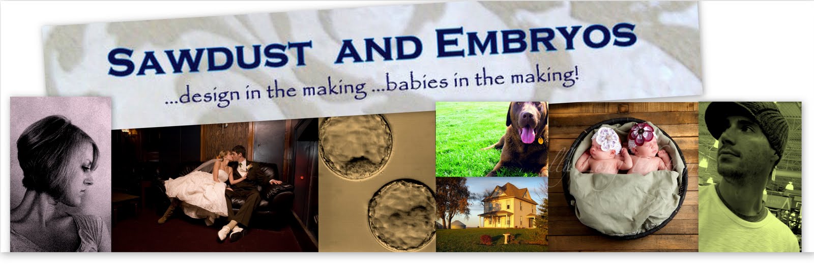
You might be thinking that Adelyn could feel left out because our new background is a “Paisley” pattern. But unfortunately, her name doesn’t represent a pattern. Things may have been different if we had named her Argyle, Houndstooth, or Damask. But we didn’t. So Paisley it is.
Also, we realized we wanted our baby girls to be represented on our title banner as more than just microscopic embryos, so we added a photo of them! It was the right thing to do.
We still can’t figure out which girl is which embryo. Let us know if you have a hunch.
So we hope you enjoy the new design! Please let us know if there are any quirky things that don’t look quite right on your computer. I’m sure there’s a few glitches to still work through. And let us know if you have any suggestions for how to make our website more user-friendly! Thanks for sticking around, you crazy people!
Related:
-

Our daughter has been living with a very small closet that isn't conducive to her…
-

Every spring, I have grand plans of having the most epic vegetable and flower gardens!…
-

Howdy friends! We've been using and abusing our Sven Sofa and Armchair from Article for…
Actually… I really liked and preferred the old look. This one is very dark and more difficult to read. I thought the other one was artsy and cute – not to mention it loaded 3 times faster than this one. I will read your blog anyway… just my 2 cents.
wish the font was larger
Love the new design and colors! nice pick. Adelyn will be OK. My parents named their photog studio after me (I was the 1st) and my siblings aren’t jealous…that I know of 😉
Beth.. Finally got a chance to take a look!
Love how CLEAN this looks! Well done!